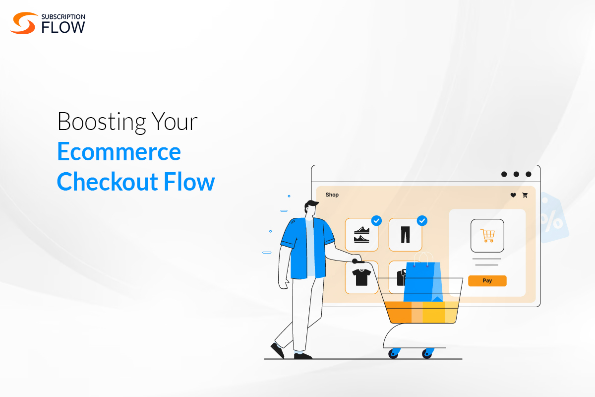
Why the Checkout Page is Key to Boosting Your Ecommerce Checkout Flow
Running an e-commerce store takes a lot: not only do you have to ensure that you sell top-quality products, you also need to invest in having a robust marketing department that keeps your potential customers aware of the product’s existence. Doesn’t it suck then finding out that almost 70% of these visitors who put items they wish to buy in their shopping cart will end up not buying them due to checkout abandonment and, in general, a faulty e-commerce checkout flow?
In this blog, we will address this issue, firstly going over the E-commerce Checkout process. Then we will provide you with a list of ways and best practices for supercharging your checkout page to ensure that your buyers go through with their purchases.
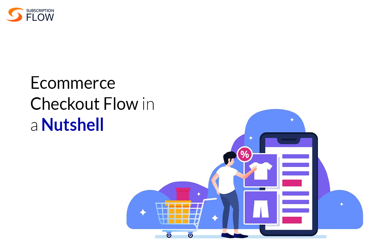
E-commerce Checkout Flow in a Nutshell
What exactly do we mean by e-commerce checkout flow? These three words refer to the process that all customers go through when they are trying to buy a product online. It begins the moment customers add products to their cart and click on it to finalize their purchase. Streamlining your e-commerce checkout process ensures customer satisfaction and efficiency by optimizing this journey.
Following are the detailed steps of the checkout process in e-commerce:
1. Making an account:
Many E-commerce stores offer discounts or vouchers that are only applicable to members of the store. Others offer loyalty points that accumulate every time a purchase is made to incentivize them to keep buying from that same store and trade in those points for a bigger discount later.
2. Viewing the cart:
Once the customer has added all the products that they wish to buy, they will then proceed to click on their cart to begin finalizing their payments.
3. Adding your information:
This is the most tedious part of the checkout process and often this tediousness is what contributes to a high checkout abandonment rate. Customers usually need to fill in the following information:
- Name
- Contact number
- Email address
- Shipping address
- Billing information
4. Reviewing the order
This refers to your customer proofreading the submitted information, and taking a final look at any additional costs like taxes or shipping fee.
5. Making the final payment
Finally, the customer then goes ahead with paying the needed amount to begin concluding the checkout process.
6. Receiving a message for order confirmation
And voila! The customer is done buying the product and will hopefully get it in however many days you will be sending the product in.

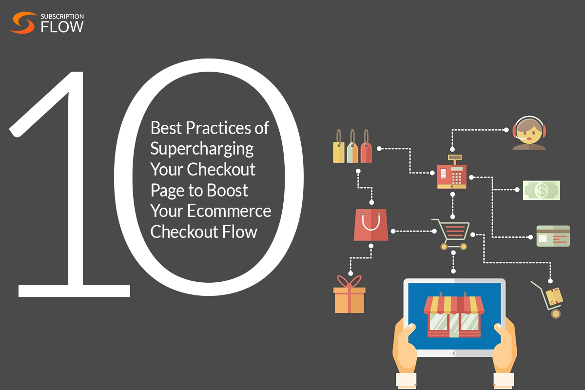
10 Best Practices of Supercharging Your Checkout Page to Boost Your Ecommerce Checkout Flow
I’m sure you dozed thrice in the previous section just reading about the average checkout process. It’s understandable. Just imagine how boring it must seem to the customers who must navigate this checkout process every time they purchase a product.
This is why, we must understand the specific ways to shorten the checkout process and make it more fun and engaging for the consumer. Read ahead to find out more about optimizing your checkout flow:
1. Offer Guest Checkouts
Ideally, you want customers to sign in or even create an account on your website to promote repeat purchases but if you lose a customer to the tediousness of this process, that’s cash left on the table. Guest checkouts are a great way of attracting one-time consumers that can later be targeted through segmented messaging to make more purchases.
2. Offer Exclusive Discounts and Loyalty Points
After simplifying your buyer’s first purchase, offer them loyalty points and targeted messaging to keep them coming back for more. Who knows? A smooth and hassle-free first-time experience with a guest checkout may encourage them to flock back for more purchases.
3. Enable Auto-filling
Ensure that your app allows the user’s data to be auto-saved so that customer data is auto-filled instead of having to type in every time and they can make their purchase instantly.
4. Gamify Checkout Progress
Many times, people end up abandoning checkout because they are just not sure of how much time it will take. Often, they end up closing the app in frustration upon being met by yet another checkout page. One simple way of countering that is by letting the users know about the progress they are making during checkout via a progress bar at the bottom.
5. Make the Checkout Page Less Cluttered
Having a visual hierarchy of your checkout page helps. This means that the page is organized to highlight the most important parts of the checkout process like adding shipping and billing information.
6. Flatten Shipping and Billing Information into One (If Applicable)
If your buyer is not paying digitally through a credit/debit card or a digital wallet and wishes to pay with cash on delivery, then there is a very high chance their shipping and billing addresses will be the same (i.e. their residence). In such cases, instead of having all CoD buyers type in the same information twice, it may be better to give users the option of ticking a box saying that their billing and shipping information is different and only then a second box pop up asking for the user’s billing address.
7. Prove You’re Trustworthy
Let your customers know they can trust you. When someone’s shopping at a new store, doubts often creep in. They wonder if the products are legit, and if the shipping is reliable (do they ship their products in a truck, and if yes, then will your precious glass duck break if it’s shipping across the country). These worries usually hit hardest at checkout, when the user’s about to seal the deal.
So, how do you ease their minds? Show them you are trustworthy. Add trust signals right where they’re making their payment. Throw in some glowing reviews, a solid money-back promise, or certifications that prove your products are the real deal. Furthermore, offer hosted payment pages so your checkout has no downtime and functions frictionlessly. SubscriptionFlow’s hosted checkout pages and endlessly customizable.
8. Make Use of Microcopying
Microcopy is basically a fancy way of describing brief explanations, usually in a small font, that clarify the purpose of each form field. Throughout the checkout process, you can leverage this microcopy to offer additional details to the customer. By providing relevant information precisely when it is needed, you streamline the experience for them by making each step simpler to navigate.
9. Offer Multiple Payment Options
The greater variety of payment options you offer, the happier your potential customers will be. Although most customers will pick from the available payment methods, some might bounce if their preferred option isn’t there. So, aim to provide as many payment methods as possible, and keep adding new ones as they become feasible for your business. You can do this by integrating with multiple payment gateways that can target different markets with localised payment options.
10. Have Mobile Optimization
A lot of people don’t even bother doing their online shopping on laptops; they swipe through their phones. If you do not offer mobile app services, you would be missing out on all these clients who just cannot be bothered with using their clunky laptops for online shopping.
Read More: Beyond the Buy Button: Streamlining Your eCommerce Checkout Process
Take a Look at Samsung’s Checkout Page to See These Best Practices in Action
Here’s Samsung’s checkout page. Please have a look at it. See what are some of the things (hint: many of them are inside a red box!) that you can spot which we have covered in the section above.
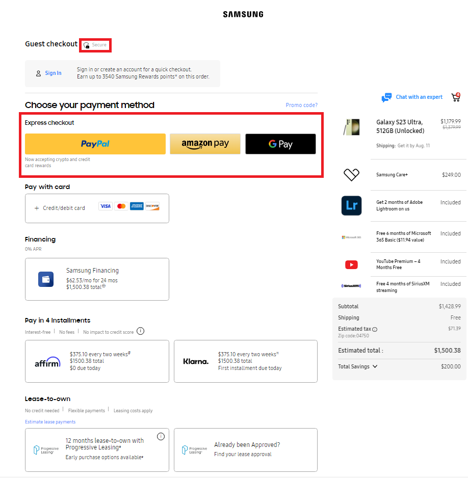
Now, for better instruction, let us go over what makes Samsung’s checkout page such a winner:
- It is simple and efficient—very little clutter.
- Trust signals are prominently placed to assure customers they are in good hands constantly.
- Countless payment methods—with the different deals that Samsung offers on each of them
- The option for a guest checkout is there.
- Overall, the page has a simple yet sleek design that goes well with Samsung’s futuristic aesthetic.
Book a demo with SubscriptionFlow now to integrate all these changes and best practices into your checkout page. SubscriptionFlow understands the importance of customization in setting up a checkout page, which is why it offers an endless list of options for users to engage with when finalizing their checkout page.
POPULAR POSTS
Think Business!
Related Posts
 How to Avoid Third-Party Checkout Charges with Shopify Custom Checkout
- Achieve Seamless BigCommerce Subscriptions Management with SubscriptionFlow
- Subscription Fulfillment for E-Commerce Businesses: Building Stronger Customer Relationships
- How eCommerce Businesses Need to Prepare for Black Friday 2022
- BigCommerce & Recurring Payments Revolutionizing the eCommerce Business Market